


Secret history of color: blue
Plus our guest curators’ favorite blue picks💙

Homer didn’t have a word for it. Yves Klein invented his own shade of it. Vermeer died broke in devotion to it. Blue is the rarest color in nature. And we’ve spent centuries trying to capture it. Today, we’re diving into its secret history (!)…from the accidental discovery of Prussian Blue to Phoebe Philo’s Yves Klein moment at 2017 Celine.
Every art lover can remember their first formative show - mine was because of the color blue. When I was in high school, my little midwestern self visited my cool older cousin in NYC and lives were changed - I ate food on “small plates,” took pics on a rooftop, and had my first whiff of Palo Santo (this was 2014 Greenpoint after all). But the real revelation? When I went to the MoMa to see Matisse’s Blue Nudes. I’ve been obsessed with that color ever since. Today, we’re doing a deep dive into my first love.

WHEN DID BLUE BECOME EVERYONE’S FAVORITE COLOR?
My love of blue isn’t exactly unique. Last week, T Magazine asked, “Why Are We So Obsessed With Blue?” Elsa Peretti’s blue-clad bedroom at Can Noves has been all over my IG feed. Silky cerulean fabric swatches are already pinned to the Alex Mill 2026 design boards. But our adoration for the hue is actually pretty recent—blue is one of the most elusive colors in history.
Historically, blue was almost a myth. It’s the least occurring color in nature (you can’t exactly scoop it from the sky) and for most of human history…it wasn’t even there. It was the last major color to be named in language – after black/white, red, yellow, green - because people couldn’t describe what they’d barely seen. And once we figured out how to make it?! Prepare to go broke. Blue was so expensive that it was reserved for the royal and the divine.
It took centuries for it to go from rare and unnamed to one of the most ~iconic~ colors of today. I’m breaking it down into the three paint pigments (and famous works) that changed everything: Ultramarine, Prussian Blue, and IKB.
1. ULTRAMARINE BLUE: more costly than gold
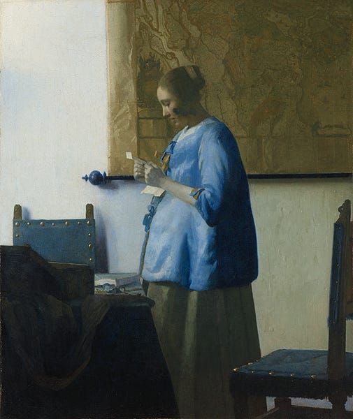
If you were a Renaissance painter, ultramarine was your wildest dream - and biggest financial mistake. Michelangelo couldn’t afford it. Rafael reserved it for his final coat. Vermeer refused to paint without it - and proceeded to put his family into debt.
Back it up: Ultramarine was the first luxury pigment. Egyptians had been mining lapis lazuli since 5000s BCE - but it wasn’t until the 6th century AD that the Byzantines made it into paint. The process was excruciating & secretive - and therefore costly - involving grinding the stone into dust, soaking it and kneading it into a paste. Add in the travel costs to transport it?! We’ve racked up a bill.
By the time it made its way on the Silk Road & into the hands of Renaissance painters, it literally cost more than gold. A couple key works (with some pretty great backstories) that use it.
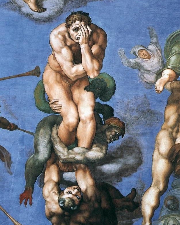
Michelangelo’s The Last Judgement (1536-1541)
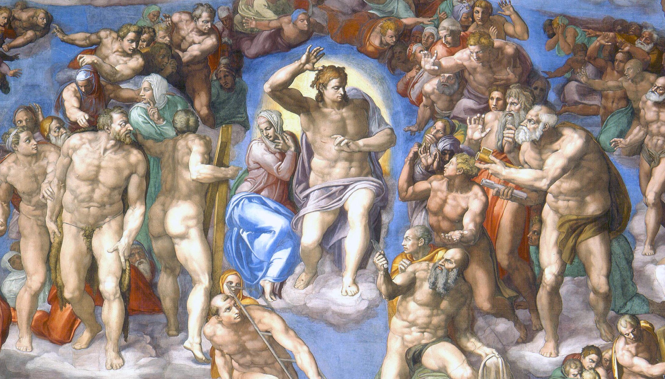
Since ultramarine was so expensive, it was reserved for big budget gigs - the church, royalty, & our girl Mother Mary’s robes. When Michelangelo was painting The Last Judgement, he ran out. Patrons couldn’t cough up the funds (Renaissance men dealing with surprise bills - they’re just like us). So, he settled for a cheaper blue - you can see above how Mary’s blue is a little more dull than the ultramarine background.
Johannes Vermeer’s The Milk Maid (1657-1658)
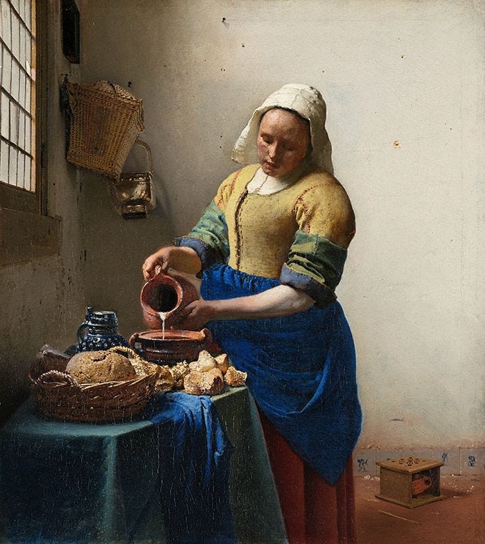
Jan Vermeer painted about 35 paintings and almost every. single. one. uses ultramarine blue. Was Vermeer rich?! Connects to royalty?! No! He loved the pigment so much that he refused to paint without it - so much so that when he died he left his family in large debts.

2. PRUSSIAN BLUE: an accident that changed art
If not for a little lab spill in 1704, blue might not be our favorite color.
Back it up: before Prussian blue, blue was a luxury. Rare! Sacred! But in the early 18th century, a German lab maker trying to mix a batch of red paint accidentally added potash containing animal blood. The result was a deep, moody, reddish blue - enter Prussian blue, the first modern synthetic pigment. (Also maybe the most profitable mistake ever made?).
Unlike ultramarine, Prussian didn’t require secret recipes or luxury gemstones. It was cheap. And it was for the people - and the people wanted their blue. Van Gogh’s night skies, Picasso’s Blue Period, Hokusai’s Great Wave - none of them would have been possible without it.
It was the first blue shade to be put in mass production. It made its way into stamps, wallpaper, the uniform of the Prussian army (hence the name). Get ready - Prussian Blue is about to be everywhere.
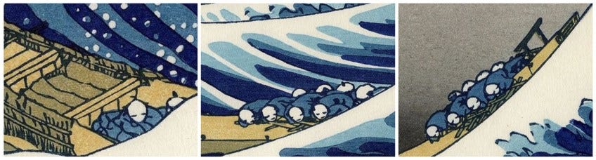
Hokusai’s The Great Wave Off Kanagawa (1831)
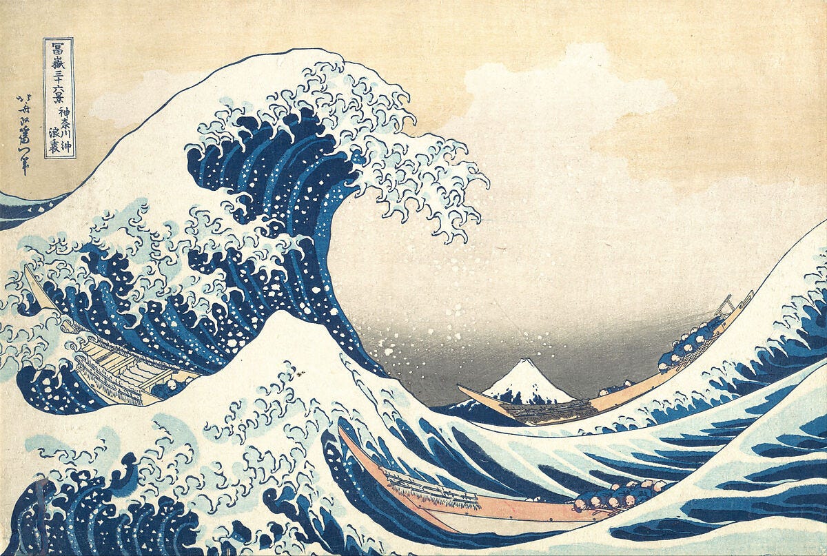
The Great Wave! OK here’s the backstory - and it’s juicy. The print shouldn’t have existed. During Japan’s Sakoku period (1600s–1800s), the country cut off almost all foreign trade. But a few sneaky Dutch traders found a loophole, smuggling in high-value goods that changed Japan forever - including Prussian Blue. A century after it was first invented - Japan had a blue revolution.
Enter Hokusai. By the time he made The Great Wave, he was in his seventies and decades into his Mt. Fuji obsession. He’d used blue before, but only cheap indigo that faded fast. Prussian Blue changed everything - it was rich, durable, & finally gave his prints real depth (a.k.a. why The Great Wave still looks as blue today as it did back then).
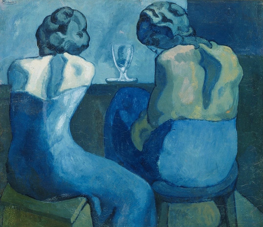
Picasso’s The Blue Period (1901-1904)
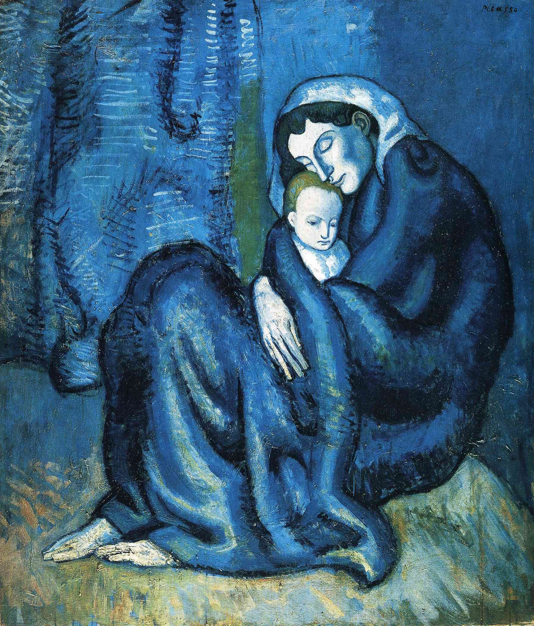
Meanwhile in Spain, our boy Picasso was going through it. His Blue Period (1901-1904) was in crisis mode, painting almost entirely in shades of blue. What was he using? Prussian Blue of course. A pigment invented by accident - smuggled into continents - and now painting some of the most famous works of modern art.
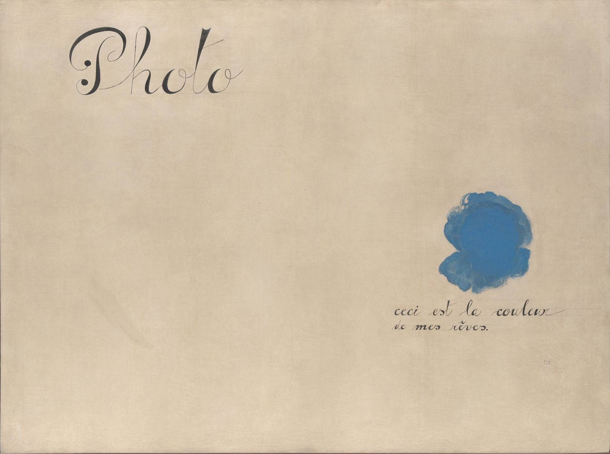
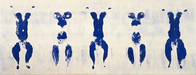
3. YVES KLEIN BLUE: the man who became a color
Yves Klein (1928-1962) loved blue so much that he devoted his (very short) life to it - and will forever be synonymous with the shade he invented.
Back it up: “IKB” (International Klein Blue) is Klein’s signature ultramarine - you can now see it everywhere from The Met to a 2017 collab with Celine. As the story goes - Klein became obsessed with the color after a night spent staring at the French Mediterranean sky - then dedicated himself to creating that exact perfect shade.
He worked with Picasso’s paintmaker to develop the formula. Soon after Klein debuted the shade at his first solo show in Milan - 11 canvases called “monochromes” - each painted in nothing but his new striking shade of blue.

Yves Klein’s career was defined by radical, almost magical grand gestures - where blue became a spectacle. And guys - he was so crazy.
For his first solo show (1957), he released 1,001 blue balloons into the streets of Paris. He invited 3,000 guests to an exhibition called The Void, only for them to arrive at an entirely empty gallery (LOL. That is lol). And when Yves got married? On top of his wife’s head = a single blue crown.
Some of his most famous work👇
Yves Klein’s Anthropometries of the Blue Epoch (1960)

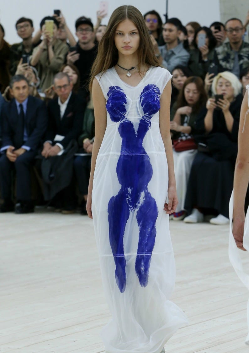
Knowing Yves Klein Blue puts you in a little IYKYK club - you will start spotting it everywhere. This viral blue bathroom is all over TikTok (& just popped up in my friend Katie Stone’s newsletter). My favorite inspo Instagram account posted this archival photo. I still see this 2017 Celine collab everywhere (more on that below). What other IKB references am I missing? Drop in comments.
Guest Curators’ Best Of Blues💙
I texted some of my most stylish, design-minded friends for their favorite blue picks of the moment…
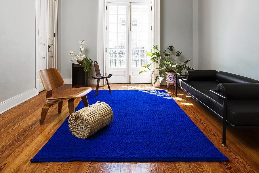
Kelsey Keith - Creative Director of Herman Miller & author of my absolute favorite design newsletter Ground Condition
“The best blue is underfoot—who cares what other furniture you have when you're walking on a pure hit of Klein blue indigo woven into gorgeous hand-loomed rugs? Txt.ure Shop is in Mexico City, and they offer three different rug types in that blue.”
Erika Verunik - author of Long Live, fellow Midwesterner, and overall long-legged godsend
“This blue moment from I screenshotted from fashion week. It’s a shade I almost forgot about. Most blue velvet I see is quite light or navy.”

Jalil Johnson - author of Consider Yourself Cultured, my everyday style icon, and profound expert in the fisherman aesthetic
“New York Movie by Edward Hopper. It’s one of my favorite paintings because I feel so drawn to the usher in the fantastic blue uniform who is maybe in a state of melancholy or maybe it’s a sense of wonder while at the movies. I also quite like the blue Alex Mill windbreaker that just launched”
(He’s talking above David btw. I love him too.)

Somsack Sikhounmuong - Creative Director of Alex Mill, author of SomStack & my boss lol
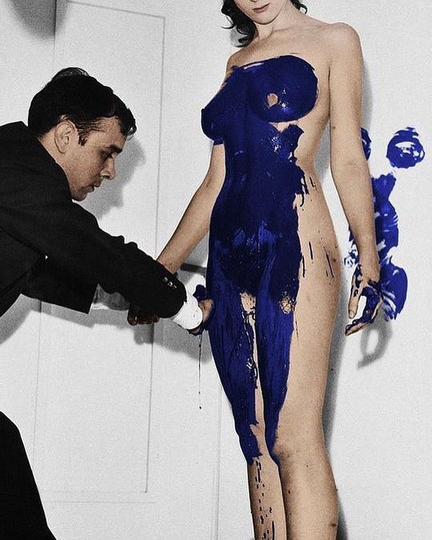
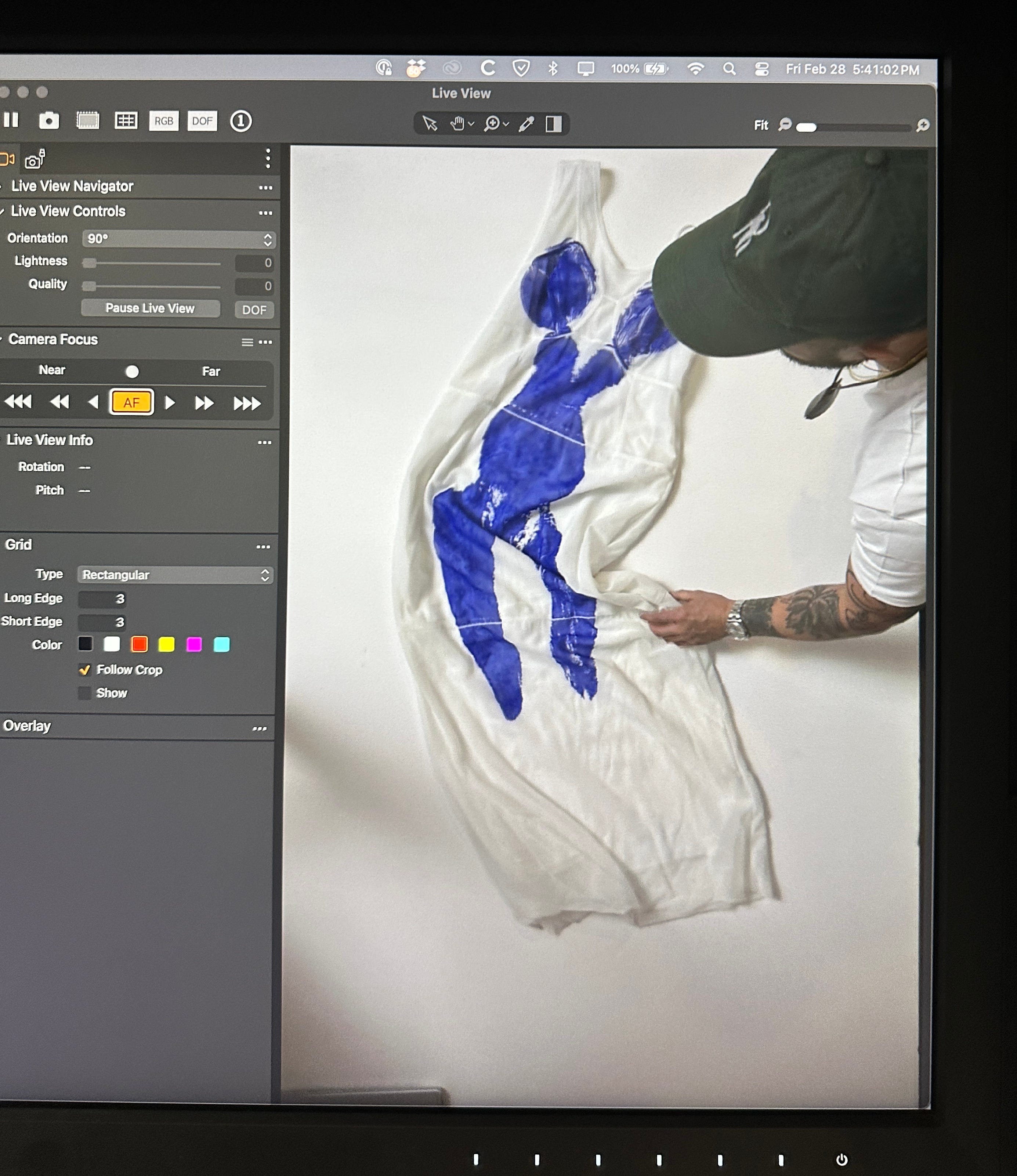
“The 2017 Celine x Yves Klein dress hanging in my closet. The backstory goes - I remember seeing it on the Phoebe Philo runway. It was obviously a really special piece. Strange. Something I’d never seen before. I went to the store and the shop guy told me - oh FYI Raf Simmons just called - they bought it.
So I thought - if it’s good enough for Raf, it’s a good enough investment for me. So I bought it too. I love this behind-the-scenes photo of it being made.”
OK everyone! That’s a wrap on blue. What other interesting strange unusual art topics are you interested in learning about? Drop in comments below or find me on Insta @rfranderson 💙
This just made me love Vermeers psintings more than I thought was possible - paintings so precious - literal “ jewel boxes”
EXCEPTIONAL READ! As someone who loves navy blue perhaps too much, this was such a great look into the history of my favourite colour. Hope you do more colour studies!