


Butter yellow was the color of the season - but when did the collective obsession with yellow begin? Today’s post is diving into the secret history of yellow - from coloring the happiest time of Van Gogh’s life to becoming a noun in Ellsworth Kelly’s work.
It’s no secret that yellow is having a moment. The clock struck 2025 and suddenly it’s everywhere - the Prada runway. Timothee’s suit. Jacquemus’ marketing. But did you know it’s one of the oldest colors in human history? Yellow has always been used to make a mark - literally - and we’re taking a deep dive into why that is.
P.S. after you've had your yellow fix, make sure you’re caught up on the secret history of blue👇

WHEN DID YELLOW START TO TAKE OVER?
Ok let’s go back in time. Way back! Before sunflowers or butter sculptures…before anything close to “art” as we know it, humans were already reaching for yellow.
Why? Because it was everywhere. Yellow is one of the most naturally occurring pigments on earth. 300,000 years ago, early humans were using yellow ochre to decorate their bodies (prelude to Chanel runway?). 17,000 years ago, our OG artists - prehistoric cave painters - made the first yellow pigments to paint galloping horses in France’s Lascaux caves.
From the beginning, yellow wasn’t subtle. It marked bodies! It caught eyes! It poisoned people (more on that later). Throughout history, yellow has been a color that’s impossible to ignore.
So how did yellow swing the pendulum in art? We’ll break down the history of yellow into the four paint pigments (and famous works) that changed everything.
1. ORPIMENT YELLOW: the deadly star of the ancient world
Let’s start with some DRAMA. This pigment was beautiful enough to rival gold, unstable enough to ruin your masterpiece, and dangerous enough…to kill you. Meet orpiment: the femme fatale of the ancient pigment world.
Back it up: orpiment is one of the first naturally occurring pigments dating back to ancient Egypt. It’s made by grinding up a mineral THICK with arsenic sulfide (yes, poison!!!). Egyptians used it for tomb murals and eyeshadow (cute! deadly!). Romans treated it as “poor man’s gold,” a substitute for actual gilding. In the Islamic golden age, it was used in illuminated manuscripts.
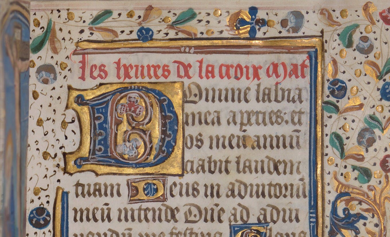
It was brilliant - but it was also wildly toxic. By the Middle Ages, the public knew it was dangerous - but we used it anyway. Because nothing else matched its golden glow.
Poisonous paint for the sake of color? That’s true love. And Rembrandt was one of the guys that said yes please.
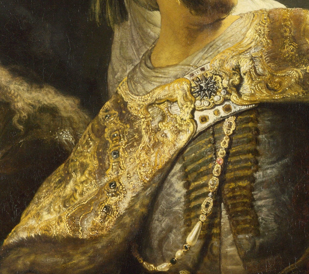
Rembrandt van Rijn’s The Jewish Bride (c. 1665)
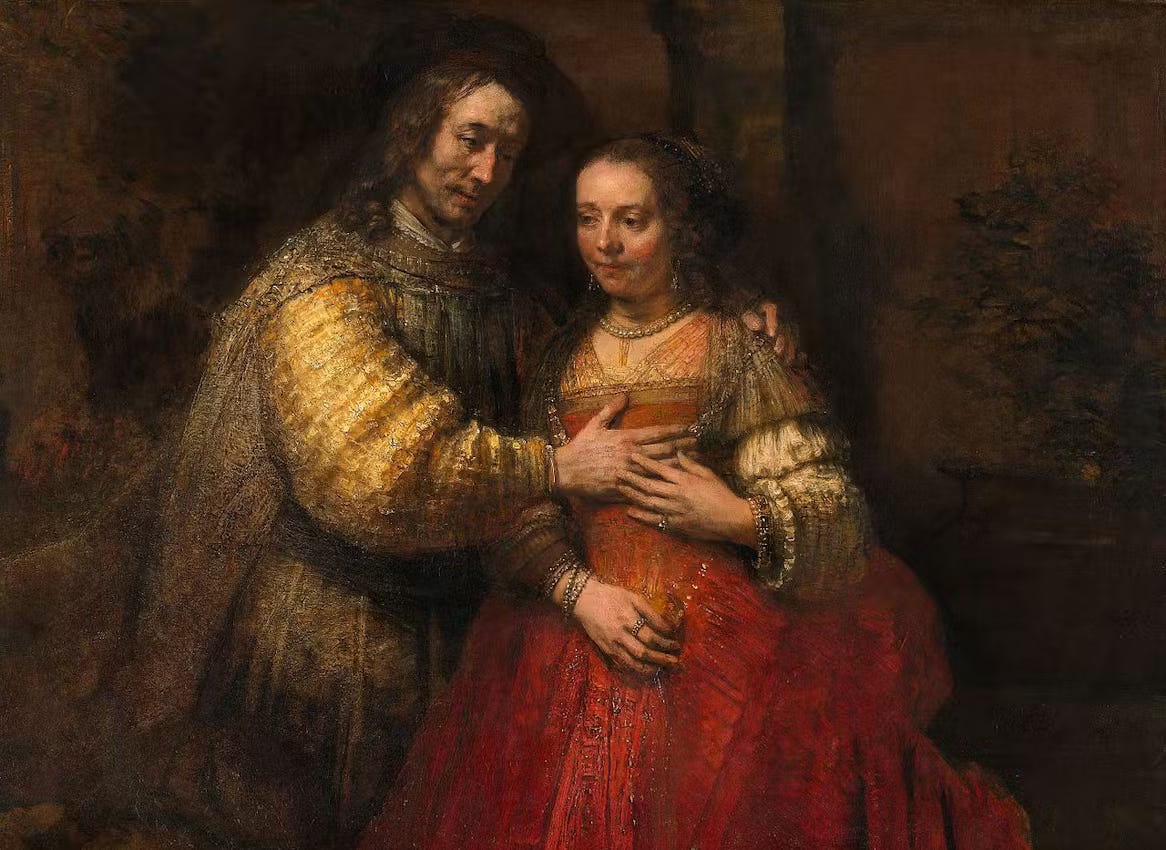
Our dear Rembrandt is known as a master of light. And he’d use whatever materials necessary to get that ~dramatic effect~. Think: strange combos of paint ingredients, incompatible pigments. You see that in the Jewish Bride - he painted with orpiment to color the bride and groom’s sleeves. Yes, he knew it was toxic & chemically unstable. And yes! He used it anyway. Nothing else got him that almost ethereal glow. Visual pay off = worth it.
2. LEAD-TIN YELLOW: the yellow that disappeared
How does a color go from being the yellow of the Old Masters to totally forgotten? Let us get! on! the! case! of lead-tin yellow - the pigment that disappeared in the 1700s only to be rediscovered in 1941.
Back-it up: after its debut in the 13th century, lead-tin yellow was the hot yellow in town - slowly replacing orpiment as a glowy & (slightly less) toxic alternative.
The old masters LOVED it. It lit up the palettes of the Italian Renaissance (Titian alert) and Dutch Golden Age (cc: Vermeer, Rembrandt). But by the 1700s, it simply disappeared - replaced by some trendy newcomers like Naples and Chrome yellow.
For over 200 years, lead-tin yellow was pretty much hiding in plain sight until a German scientist (why is it ALWAYS a German scientist?) was studying historical paintings in 1941 and came across this mysterious yellow. He realized it wasn’t Naples or ochre but its own thing: lead-tin yellow. He REVERSE ENGINEERED it to bring it back to life. The yellow of the old masters has returned! What a comeback!
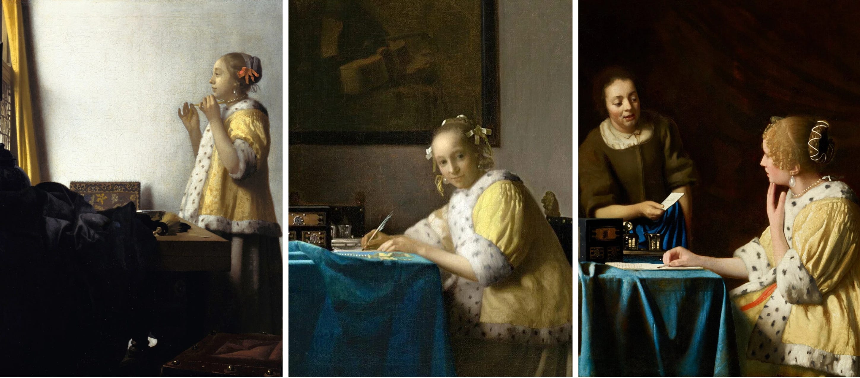
Vermeer was one Old Master who put it on the map:
Johannes Vermeer’s The Woman with a Pearl Necklace (1664)
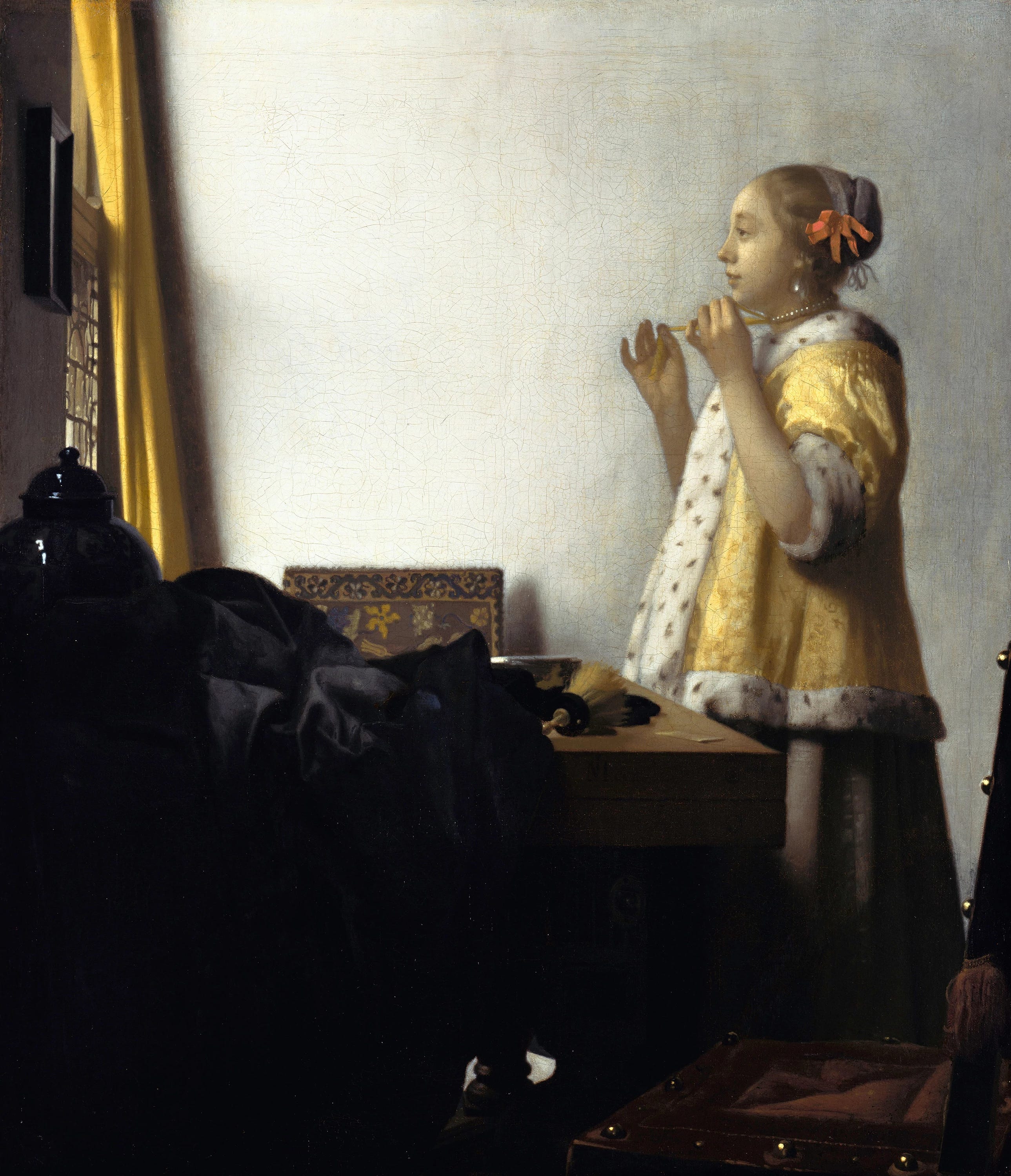
Vermeer was famously slow - just 34-35 paintings in his lifetime - so every pigment used was very intentional. Unlike Rembrandt, Vermeer only a handful of carefully selected colors, all made by hand. His go-to yellow? Lead-tin.
Lead-tin was warm. Stable! Could give him that ~fancy glow~ Vermeer is known for. Orpiment was too volatile & chrome yellow didn’t exist yet. Lead-tin yellow was the only choice.
Keep reading to my Guest Curators’ Yellow Picks below - Somsack blesses us with Vermeer commentary I can’t stop thinking about….
P.S. I was curious if lead-tin yellow ever made its way back into popular art - the short answer is no. By the time it was rediscovered in 1941, modernism was already in full swing. Now, it seems to be made by niche pigment companies, mostly for historical analysis or restoration.
3. CHROME-YELLOW: Van Gogh’s golden child
When you think of Van Gogh’s sunflowers, you’re thinking of Chrome Yellow - it’s the yellow of the Impressionist era.
Back it up: it’s 1809 and Chrome Yellow was born in a lab (19th century = peak time mad-scientist-pigment-boom). Our artist crowd LOVED it. It was rich! Saturated. Totally alive.